In this time of rapid global change it is important to periodically step back and and reassess your mental models of the world. Doing this enables you to verify (or reject) previously held assumptions that influence your global views. Below are world maps that will help you take a step back and review how accurately you see the world.
From The Perspective of All Living Human Beings, Are You Normal or Strange?
The location of the world’s population:
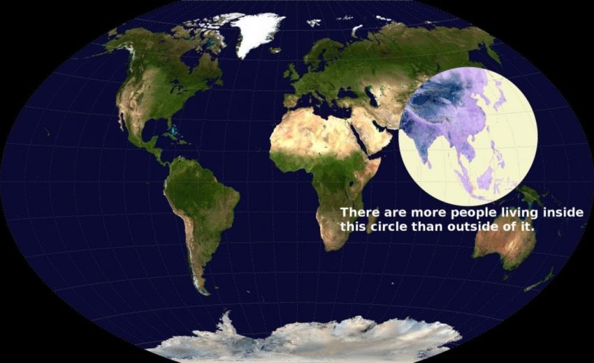
If you live within the circle depicted above, your lifestyle and culture is likely considered usual when compared to all living humans. If you are living outside of the circle, your lifestyle is likely statistically abnormal.
Source:
The Washington Post: Caitlin Dewey
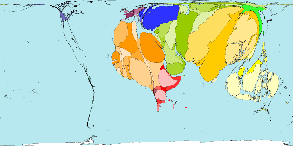
The proportion of people who live on the equivalent of $1 USD or less a day:
This map shows the proportion of people who live on the equivalent of $1 USD a day or less. If you live on more than that amount, you are doing better than 1/3rd of all people living. If you happen to make more than $32,400 USD a year, then you are in the top 1% of all highest paid people on earth. (To check your estimated wealth ranking globally, see this online tool.)
Sources:
- Map © Copyright Worldmapper.org / Sasi Group (University of Sheffield) and Mark Newman (University of Michigan) / Benjamin D. Hennig.
- Top 1% Data
Are Your Standards, Standard?
The prevalence of male circumcision around the globe:
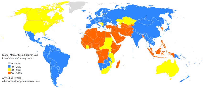
Above is a map of the prevalence of male circumcision around the globe. The usefulness of male circumcision is hotly contested but it is a social norm that is very personal and very tied to location.
Source:
World Health Organization and Wikimedia
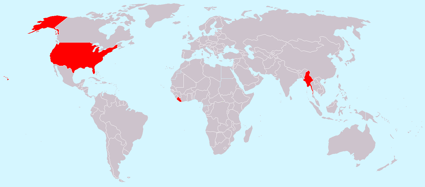
Countries which don’t use the metric system:
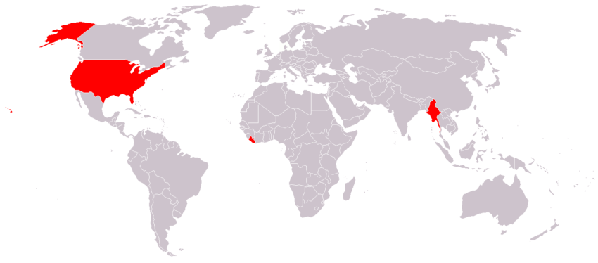
The map above shows which countries don’t use the metric system. The United States, from an efficiency perspective, is holding humanity back with our antiquated system. The reluctance to is largely caused by no American generation wanting to pay the costs (both in money and in accidental deaths) of converting to what is clearly a better system.
Source:
Wikimedia
Street driving side by country:
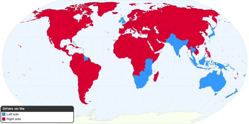
This map shows the side of the street that citizens of each country drive on. Note the disproportional influence of the United Kingdom and United States on the world’s drivers.
How is your perspective of other countries different from people in other countries?
“Which country is the largest threat to world peace?”:
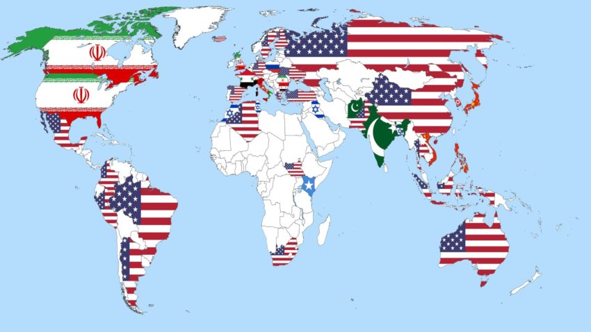
A map of nations when asked the question “Which country is the largest threat to world peace?”. Data from 2013.
Source:
Reddit User: loulan
Proportion of the world’s adherents to Islam by territory:

The territory size shown in the map above illustrates the proportion of the world’s adherents to Islam living there. Note the small proportions in North America and Europe and it is hard not to relate this to the high amount of fear Americans and Europeans have of this culture. People fear that which they do not know or understand.
How Easy Is It To Enter or Leave Your Particular Cultural Bubble?
Non-military aircraft routes:
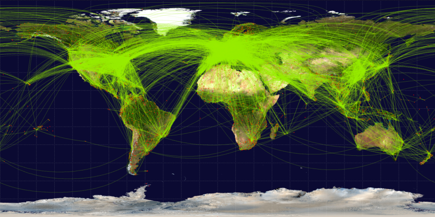
This graphic maps global non-military air traffic. Note the proportion of flights between countries in the northern hemisphere (particularly America and Europe). If you have access to multiple direct flights out of your country from your city, your situation is unusual when compared to most cities.
Source:
Open Flights, (With data from DAFIF & OurAirports.com)
Net in-tourism:
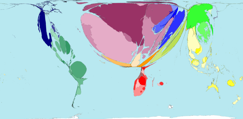
The map above shows Net In-Tourism. Obviously, flight availability highly correlates with tourism.
Source:
© Copyright Worldmapper.org / Sasi Group (University of Sheffield) and Mark Newman (University of Michigan) / Benjamin D. Hennig. (Note, this data is likely from the early 2000s. While out-dated, it still does a good job of showing tourism disparity)
Net out-tourism:
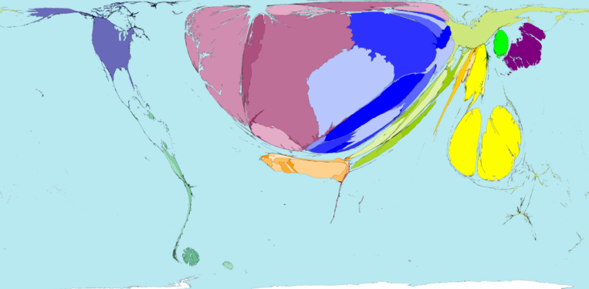
The map above shows Net Out-Tourism. As you can see, the map is dominated by Germany, the United Kingdom, the Czech Republic, Malaysia and Poland.
Source:
© Copyright Worldmapper.org / Sasi Group (University of Sheffield) and Mark Newman (University of Michigan) / Benjamin D. Hennig. (Note, this data is from 2002)
Are there other maps that have changed how you see the world? If so, please consider sharing them with the community by leaving the URL in the comments below.


